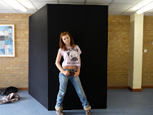
On this cover, there is only three colours: red, black and grey, which is what the model is wearing. There is only two fonts: the title and headlines. The main story is made bigger so its easier to locate. The model is famous and well known. The photo is medium shot, and the model is placed infront of the title, which emphasises the magazine is well known and customers can reconize it. Although the cover is very spaced out, the headline and title overlap.

No comments:
Post a Comment