About Me

My photo
My name is Alysha Pearson and I go to Heworth Grange Comprehensive. I take A Level Media studies, English Language and Sociology

Wednesday, 23 March 2011

Props


Props are important in a production because they can show the audience subtle messages, for example, in our production we used a t-shirt that said 'I <3 VIVO' which implied the girl is a fan. We used other props such as a car, the fan letter, a glass of wine and the suicide note. Here are some of the props we have used.
 Microphone and headphones to give the impression Alex is recording
The lipstick I used in the first scene
 The signed picture of 'vivo'
 The magazine with vivo on the front
 Preston - the dog used in one of the scenes, we chose a small 'handbag' dog to imply Alex is a celebrity
The tripod the photographer uses.

Thursday, 17 March 2011

Recording Studio

One of the most important locations in our production is the recording studio within our school, as there is so much expensive and professional equipment in this room, we have to seek permission and be observed. We booked the room for an afternoon when we all have free lessons, and took two cameras along with two tripods so we got a good range of angles. Our observer also used  HD (high definition camera). We positioned Alex in the recording room and played a soundtrack as she sang along. The filming was very successful and we got lots of useful footage. Here are some photos I took whilst we set up and filmed.


Locations

I am in charge of locations and I feel chosing famous landscapes in the north east will put a very personal feel to our film,for example, the Quayside. We needed a broad range of locations as our questionnire showed us that this is what our focus group want to see. I needed to find realistic locations for shots of the stalker, for example a bed room and a small office, where as with the singer I needed to find locations that showcased her as being a celebrity, e.g. the recording studio. There is quite a dark atmosphere in the video, so I also needed locations that gave this impression, e.g. small paths and dark parks. 

Song

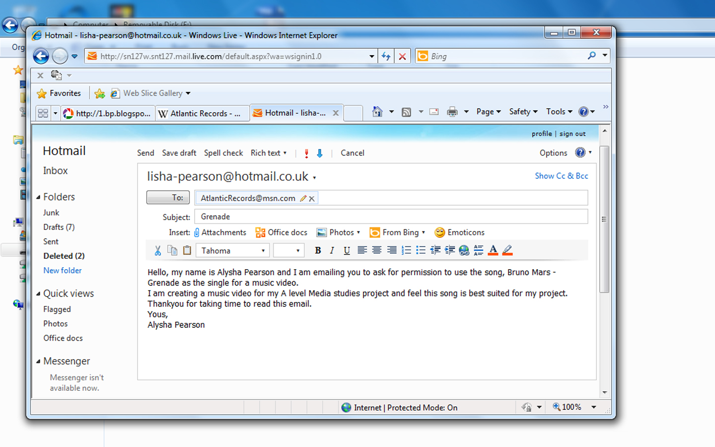
After endless listening and researching different songs we decided to use Bruno Mars - Grenade for our music video. We decided this as pop was the most popular genre, it is in the charts and the lyrics are about love. In oder to seek permission to use the soundtrack, I emailed the record label (Alantic records) to ask if we could use the song.

Research and planning - inspiration

Our music video is very narrative, we have been inspired by the following videos. We particularly like the story line of a stalker and would enjoy making our own music video based on this idea. i favour the Eminem video more because I like the way he has used a character as the main character, where as in the other video, she is featured through the entire song. I think this challenges music video conventions and has inspired me to do this in my own project.

Mariah Carey - Obsessed

Eminem - Stan (Short Version) ft. Dido

Story boards

Here is an example of our story boards, which we used as a guide whilst filming. We recorded things on here such as angle of shots, what type of shot, shot duration, sound etc.


Questionnaire

We handed out the following questionnaire to 50 6th form students, as they are our target audience. These are the results (the most popular answer in in bold)
What genre of music do you listen to the most?
Pop
R & B
Rap
Rock
Classical
Other

Who should be the main character in a music video?
Young male
Young female
Older male
Older female

How many locations would you like to see?
Less than 5
More than 5

How would you like to see the music video?
Black and white
Colour
Both

Would you like to see slow motion and sped up shots?
Yes
No

Would you like the video to have a narrative?
Yes 
No

Here is the results in a more quantative form


Music video

We have now decided to produce a music video. We have created mind maps of our ideas and have already decided our individual roles;
  • Emily will be in charge of filming and she will also be used as an extra
  • Alex will be in charge of editing and also act
  • I will direct (which includes costumes, make up and locations) and also act
We have purposely give ourselves the main acting roles in the production as last time we found using people outside the group caused difficulty.

Change of plan...

Due to a number of factors we have decided to change our project and instead create a music video. We find that the horror trailer is very challenging and the footage we had produced so far doesn't look authentic. The main thing I dislike about our project s is all of the non- diegetic sound. There are also factors beyond our control, for example the actors we chose are very unreliable and finding a time to film was very difficult. Making the decision to change projects has left us very far behind but we hope this sense of urgency will motivate us.

Wednesday, 2 February 2011

Music

The results on the questionnaire told us that the auidence found slow, quiet music scary, here are some opitions of music we are discussing:
Gary Jules - Mad World

Phonogram Records

Mercury


Andreas Kleerup - Until we bleed

Positiva Records (UK)


Evanescene - My Immortal

Wind-up


Marylin Manson - Sweet dreams

Locations

One of my roles is to find suitable locations to shoot our production. I came up with the following possible places;
- Bedrooms
- Bathroom
- Long path
- Street
- Dark room
The bed rooms will be used in the first clip showing the girls playing the Ouija board as a bedroom is a perfect location for a 'sleep over' and I want the audience to relate to what is happening. The bathroom will be used to show a message left from Simon. The long path is perfect for a chase scene, where the victim has plenty of space to run. The dark room produces a spooky atmosphere, and is a basic horror movie convention.

Our trailer

This mind map shows the features we will use in our production

Plot

Filming

We have realised that we need to focus on what kind of shots we are going film, the camera movement and the surrounding environment. We are considering the following tips;

- Get physically close to your subject (rather than using zoom)
- Film scenes using more than one shot
- Film more than just your subject
- Film at the same height as your subject
- Use a tripod
- Control lighting

When filming we must consider the types of camera angles;
- Eye-Level
- High Angle
- Low Angle
- Birdseye

Although I am not in charge of filming, I will be given an opportuinty to film some shots.

Monday, 13 December 2010

Film anaylsis


To get a few ideas of basic conventions of horror trailers, I have watched and analysed existing trailers, that have similar factors to the answers of the questionnaire, for example, Tormented. Tormented is a 2009 horror-comedy, directed by Jon Wright and written by Stephen Prentice, the film was released on May 22, 2009 in the UK.  The world premiere took place on May 19, at the Empire Cinema, Leicester Square followed by a national premiere at Cineworld in Birmingham. The film's budget was under £1 million.
         The film is based on a bullied teenager who commits suicide, and then comes back to haunt his school mates. It is a very modern movie, staring the cast of popular TV drama 'skins'. The target audience is teenagers, the same as mine.
         The trailer opens with title cards of the producers, etc. The pop soundtrack is quite modern and fast which compliments the fast camera movement. The opening sequence is actually a scene from the movie, I think this is a good opening sequence and it teases the audience and makes them want to see the whole movie. There is a selection of close ups, followed by transitions such as flashes and cuts which I think is very effective. The lightening is very dark, which gives a creepy, scary effect. There is a combination of two clips, by cutting from one to another.The trailer is full of reaction shots, to show the terror in the casts faces. At 38 seconds (about a quarter of the way through) there is a flash and a title card appears with the word 'Tormented' (the films name) there is a slight change in music when the title card appears, with a sound effect, then the music changes to a loud pop song to emphasises the characters are at a party. There is many shots of the party, showing different characters and what they are doing, followed by a title card 'in this world' then more quick shots of the party. There is another title card 'your either somebody' , more party shots and a final title card, 'or you're nobody'. Next there is a voice over 'how should we remember Darren Mullet?' as two scenes from the film are combined with the use of quick cuts and transitions, it basically summarises what has happened in the film. There is a flash/transition to a funeral scene to emphasise the boy is dead, using fade ins and out. There is loads of different quick cuts of scenes in the film showing Darren getting bullied. The only sound is speech. The trailer reveals a little bit about the plot, by using quick cuts and clips from the film. After that a slowish soundtrack plays to add a 'creepy' effect. There is voice overs on the clips to explain what is happening, followed by a freeze frame. The next clip is split up with quick flashes/transitions. The next bit shows Darren in a hall full of school kids whom are moving really quickly and not noticing him, giving the impression he's not really there, followed by a title card 'the best days of your life'. The film speeds up after this, showing several quick shots of scenes from the film, and the soundtrack gets louder, followed by another title card 'don't last forver' which explains the next clip of the girl drowning.The clips are separated by fades in and out, each clip reveals a little bit about how each character dies. The trailer ends with a title card of the title, 'Tormented'


http://www.imdb.com/title/tt1100053/
Tormented Poster

Wednesday, 8 December 2010

Questionnaire results


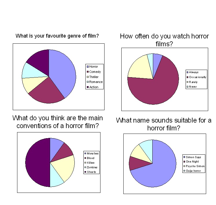
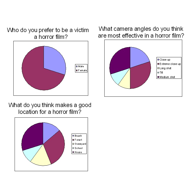
Looking at the results, we have decided that we will shape our trailer around the most popular answers, for example, using female victims and using ghosts. The results of our questionnaire stated that the conventions most preferred are ghosts, so we intend on basing our storyline around this by using a Ouija board in our trailer. We also wanted to find out what locations the audience would like to see, and discovered that a forest and houses were the most popular in a horror film, so again we are going to film a few scenes in these kinds of locations, by filming in bedrooms and bathrooms. We were unsure of who the victim should be throughout our trailer, however after analysing our results we decided to make the victim a girl, as they are the vulnerable. We gave the audience a choice of film titles, and the results showed 'simon says' was the favourite. We gave this option as 'simon says' is part of the plot.

Monday, 18 October 2010

Questionnaire

We handed out a questionnaire to fifty people, to find out what the auidence wanted to see in our horror trailer, these are our results; (the answers in bold are the most common)

How old are you?

1. Under 15
2. 15-24
3. 25-30
4. 30 +
What is your favourite genre of film?
1. Horror
2. Comedy
3. Thriller
4. Romance
5. Action
How often do you watch horror films?
1. Everyday
2. Once a week
3. Once a month
4. Never
What do you think are the main conventions of a horror film?
1. Monsters
2. Blood
3. Killers
4. Zombies
5. Ghosts
What do you think makes a good location for a horror film?
1. Beach
2. Forest
3. Graveyard
4. School
5. House
Who do you prefer to be a victim in a horror film?
1. Male
2. Female
What name sounds suitable for a horror film?
1. Simon Says
2. One Night
3. Psycho Simon
4. Ouija horror
Should the trailer be in chronological order?
1. Yes
2. No
What camera angles do you think are most effective in a horror film? (Pick 2)
1. Close up
2. Extreme close up
3. Long shot
4. Tilt
5. Medium shot close up
What type of music do you think is the scariest?
1. Slow, quiet
2. Fast, loud

Monday, 11 October 2010

A2 Film Trailer

For my A2 project, I am working in a group with two other people ; Emily Laws http://www.emilylaws.blogspot.com/ and Alex Mctiernan, http://alexmctiernan.blogspot.com/ to make a trailer for a horror film , along with a poster advertising the film and a DVD cover .We chose horror as the genre as the questionnaire we gave out showed that horror film was the most popular genre. We will use photo shop, an editing program, cameras and cam recorders to complete these tasks. As we are working in a group, we will all contribute to the production of the trailer, however our own creativity and skills must be shown throughout individual responsibilities, for example I will be directing and in charge of locations, although everyone will be giving the chance to direct, film and edit.

Thursday, 11 February 2010

AS Evaluation

In what ways does your media product develop or challenge forms and conventions of real media products?
I have created a weekly music magazine, which consists of six pages, which are a front cover, a contents page, and a two-page spread article. My magazine genre is dance and pop/R&B. It is aimed at sixteen to twenty-four year old females, as my questionnaire results showed this was the most popular age and sex. To get an idea of conventions, I researched and analysed other music magazines, such as Q and NME, and with this help I made my pages.

Front cover
• Name of the magazine as masthead
• Barcode
• Price
• Issue date
• Attractive female model (however I have challenged this convention and left aligned my model, where as most magazines have their model centred)
• Full body shot
• Minimum of three colours (hot pink #fc1a9a, black #000000, white #ffffff)
• Minimum of three fonts (Haettenschweiler, pussycat, Century Gothic, Arial Black)
• Exclusive main story as a banner
• Free downloads for the reader
• Cover lines


Contents page
• Stories are sectioned
• Same model as cover (this also challenges other magazines as some use different models)
• Pictures related to the stories (hooks)
• Editorial
• Image of the front cover
• Same colour scheme as front colour to emphasise brand identity
• Same fonts as cover to keep a house style


Article
Article
• name of "artist" as title
• two images of model (the same model as the cover)
• quotes to draw the audience in ot “the best bits”
• page numbers
• Standfirst (an introductory paragraph in an article, printed in larger or bolder type or in capitals, which summarizes the article)
• text is in columns
• minimum of three colours (blue #1ae4fc, black #000000, white #ffffff)


How does your media project represent social groups?
My article is about a blossoming young artist who won the hit TV talent show, “The X Factor”. This relates to most people as just about everyone watches this show. It also relates to young girls, (16-20) as my artist is only young, and it shows that her dreams came true, my article indicates that the model was just a normal girl, whose dreams came true, so I believe that my magazine represents young working class females of no specific youth subculture, in a positive light. I also used an attractive model, which relates to Naomi Wolf’s theory (1990’s), that having a sexually attractive model will influence women, as well as men, because they too believe they can look like that, if they buy the products promoted or live their life like the models.

What kind of media institution might distribute your media product and why?
I don’t believe that there are many music magazines with the same genre on the market at the minute, however the few that have “pop” genre are very big, for example “top of the pops” and “smash hits” (http://www.smashhits.net/)

However, this magazine does not have the same audience as mine, for example the models are the cast of “High school musical”, a children’s show, so this suggests that the age range is for children, however some stories are about “celebs, gossip and love” and I don’t think children would read this, this emphasises the magazines has a large age group. I don’t think there is a gap in the market for my magazine, as it does not follow all of the “pop magazine” conventions, however if a big publishing company like Bauer, were to publish my magazine it would widen their market because of my magazines unique style and content and the target audience. My audience is for sixteen to twenty year old women, who move on to lifestyle and celebrity magazines, so this is my niche audience.

http://www.totpmag.com/(http://www.smashhits.net/)


What would be the audience for your media product?
My target audience is 16-20 year old, working class females. So ideally I would like a young student, perhaps with a part time job with a low yet steady income. I’m also aiming my magazine at females interested in music, so their income should be spent on downloads and gigs.

I have decided to make a “profile” for my perfect target audience.
Name: Polly Ellison
Age: 17
Sex: Female
Job: Student, but I have a part time job in a shop
Weekly income: £95
Interests: Shopping, reality/talent shows, travelling
Favourite genre of music: R&B, pop, rave and dance
Favourite artists: Rihanna, Britney Spears, Lady GaGa and Katy Perry
Why would you buy Encore: I like the colours on the front cover, they are very girly and bright which catches my eye. I watch The X Factor all the time so I would want to read this. I like the artists featured on the cover and I like reading about gigs and awards.
Polly is in my age group as she is seventeen. This research has helped me as I now know what my target groups spend their money on, what genres of music they like and how much they spend on music related products i.e. iTunes, gigs and music magazines.


To get an idea of my target audience and what they would like, I created a questionnaire which was taken by 100 people. The highlighted answers were the most popular. This is I got the name of my magazine “Encore” from. An encore is an additional performance added to the end of a concert, from the French "encore", which means "again", "some more”. I also found out my target audience, genre price and colour scheme, this when I decided to add a “free download” voucher on my cover, as downloads appeal to young people, i.e. my target audience, as this a common way of obtaining music for this age group. I then had to decide on my main story/article, and decided to use a young model, who won “The X Factor” This relates to most people as after I researched my target audience I found it is popular. I wanted my magazine to appeal to girls, so I used very feminine colours, like bright pink, to appeal to my target audience. My research above shows that my target audience don’t have a very big income, so I made my magazine a £1.00, this would compete with other, more expensive magazines, and I also used this price as my magazine is only a weekly magazine. My article also relates to young girls, as my artist is only young, and it shows that her dreams came true. I also used an attractive model, which relates to Naomi Wolf’s theory, that having a sexually attractive model will influence women, as well as men, because they too believe they can look like that, if they buy the products promoted or live their life like the models. I looked into Marjorie Ferguson’s theory of poses (1980) and found that my model’s pose is Invitational: emphasis on the eyes, mouth shut or with only a hint of a smile, head to one side or looking back to camera. This pose suggests they’re inviting the audience into the world of the magazine.
By exploiting the Blumler and Katz’ theory of Uses and Gratifications, (1995) my model appeals to a similar age group to add an appeal, and it relates to them as they think they can be like this, she is wearing the same clothes as they would wear and they could find her inspirational.
I also used “hooks”, (“the video music awards exclusive”) which I based on existing products and audience research to influence my audience, on my front cover, which is a typical magazine convention, I done this so I could “draw the audience in” and they can see what else my magazine includes, including my main article.


What have you learnt about new technologies from the process of creating this product?
I used many new technologies that I had never used before to create my project, such as digital cameras, Photoshop and Blogger.
I have edited photos using tools such as;
• Burn tool – to make the models skin look more tanned
• Polygonal Lasso tool – to crop the photo and get rid of the background
• Smudge tool – to even out the models skin
• Brush tool – to emphasise the models eye make up
• Colour replacement tool – to change the models clothing colours
• Red eye removal
• Clone tool- to lengthen clothing or hair


This is a photo I have edited. As you can see I had to cut the model out as the photo was took on a red background, so I cut the model out, and then changed the photo to medium shot. I used the burn tool on her skin as I have used the same model for the cover, and I tanned her skin on the cover. I used the colour replacement tool on her eyes to give the impression she is wearing more eye make up. This photo is good as it is not blurry and I like the way she is looking at the camera, but her eye is slightly hidden behind her fringe, which gives a mysterious effect, making the reader want to read the story.


This is another example of a photo I have edited. I have took the photo on a red backdrop, so it’s easier to edit. I used a digital camera and a tripod to take the photo. Here’s how I accomplished the final photo:
• Polygonal Lasso tool – to crop the photo and get rid of the background
• Eraser tool – to get rid of any excess background
• Clone tool – to make her top all one colour
• Clone tool – to crop her hair short
• Brush tool – to give the impression she is wearing eye make up.


I have also learnt how to use www.blogspot.com This is a website where I made my own blog, to record my progress. On blogspot, you can also add photos to describe your progress and process. The blog is like a media portfolio on the internet so it can be viewed by people around the world.

Looking back at your preliminary task, what do you feel you have learned in the progression from it to the full product?
Looking back at my first drafts, I feel that I have learnt so much since I started the course, in September. I have learnt new technologies like how to work digital cameras and Photoshop. I have learnt how to edit photos and change the saturation and adjust colours. I have learnt how to record my progress and process on a blog, for others to see. I have learnt how to target specific audiences, researched conventions and media language and the way it’s used to appeal to an audience. I’ve used my improved technology skills to help me achieve my goal ok, from analysing magazines to looking up theories and theorists. I have put everything I have learnt and all my skills into making my product look as real as possible, and I think I have achieved this. I have created the product aimed at a niche audience, but for a large, nationwide one, compared to my preliminary product. I’ve created my product based on careful research, to exist on shelves along side NME and Q, with a specific nationwide audience in mind.
When I showed my final product to Polly Ellison, this was her reaction: “wow that looks so real, it could be on the shelves in a news agent! I like the way the pink is feminine but it contrasts with the black to give a punk effect! I also think the free downloads is a good idea and it would influence me to buy it.”
Wednesday, 10 February 2010

Monday, 25 January 2010

Article Final


I have put my text into the columns and I changed the photos as the previous bunch were poor quality. I have embedded the quotes and added page numbers. Here are the conventions:
- 2 photos of models
- Page numbers
- Quotes
- Introduction
- Columns

Cover Final

I have used a new photo on this attempt, as I thought the other photos were too blurry. I have added a "free downloads" to influence readers, and I also added a slogan, "we want more" as Encore means "again" in French. Here are the conventions of my cover.
- Date
- Price
- Barcode
- Free downloads
- Model left aligned
- Hooks of other stories
- Main story in bigger text
- Model over the title

Contents Final


  • Since I have changed the photo on my cover, I had to put the new cover on. I used a different model for my editor and made a background for her photo by making to rectangles, one black and one white. I also moved my main article to page 4-5, as after researching, I found that most music magazines don't have their main story so early in the magazine.Here are the conventions I have used:
  • - Page numbers and stories
  • - Letter from the editor and photo
  • - Image of cover
  • - Images of other stories
  • - Stories sectioned

Wednesday, 9 December 2009

Contents


I have added a few pictures to my contents page. I used a photo that I took myself of "the editor" and placed her above "the letter from editor". I saved my cover, then uploaded it here and placed it next to "on the cover" so buyers can refer back to it. I still needed to fill space, so I decided to put the HMV logo on, as it is one of my "stories", however I couldnt use it as I did not make it myself, this is what I came up with..


www.HMV.com